How to Use the 60-30-10 Rule of Design
Choosing paint colors, furniture, and accessories can feel overwhelming, especially when every color you love seems to compete for attention. Learning how to use the 60-30-10 rule is one of the easiest ways to create a room that feels balanced, comfortable, and pulled together. Whether you’re decorating an entire home or refreshing a single room, this simple design guideline gives you a framework that makes choosing colors much easier.
The 60-30-10 rule is a classic decorating principle that divides your room into three color groups. One color becomes the main foundation of the space, another supports it, and a third adds personality through smaller accents. The result is a room that feels cohesive without looking flat or predictable.
What Is the 60-30-10 Rule?
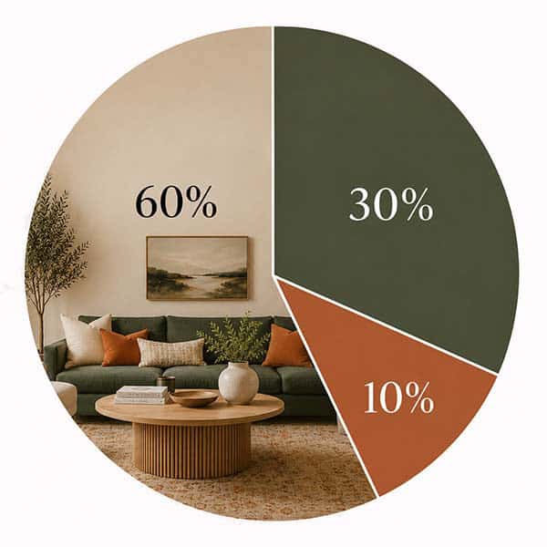
The idea is simple.
- 60% is your dominant color.
- 30% is your secondary color.
- 10% is your accent color.
These percentages don’t have to be measured exactly. Instead, think of them as visual balance. The goal is for one color to lead, another to support it, and the final color to add energy and interest.
Start with Your Dominant Color
Your dominant color covers about 60% of the room. This is usually the color people notice first because it appears on the largest surfaces.
Common places for your dominant color include:
- Walls
- Large area rugs
- Flooring
- Large sofas or sectionals
- Curtains
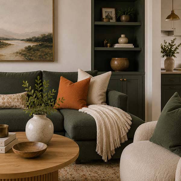
Neutral colors such as white, cream, beige, taupe, gray, or soft greige are popular choices because they create a calm backdrop that works with many decorating styles. That doesn’t mean your dominant color has to be neutral. Soft sage green, dusty blue, warm terracotta, or muted olive can also create beautiful foundations when used throughout a room.
Choose a Supporting Color
Your secondary color makes up about 30% of the room. This color adds depth and keeps the design from feeling one-dimensional.
You might use your supporting color on:
- Accent chairs
- Upholstered furniture
- Bedding
- Window treatments
- Built-in cabinetry
- Feature walls
This is a great opportunity to introduce richer colors like navy blue, forest green, charcoal, rust, or deep burgundy. Since this color appears less often than your dominant color, it creates contrast without overwhelming the space.
Add Personality with an Accent Color
The final 10% is where the room comes to life.
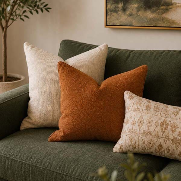
Accent colors are found in smaller decorative pieces that naturally draw the eye.
Think about adding color with:
- Throw pillows
- Artwork
- Lamps
- Vases
- Decorative objects
- Fresh flowers
- Small accessories
Bright yellow, coral, emerald green, turquoise, burnt orange, or even metallic finishes can all work beautifully as accent colors. Since these items are easy to swap out, changing your accent color is one of the simplest ways to give a room a fresh seasonal look without buying new furniture.

Mix Shades and Textures
The 60-30-10 rule doesn’t mean every item has to be the exact same shade.
Using lighter and darker versions of your colors creates depth and makes the room feel more natural. For example, if gray is your dominant color, you might include warm light gray walls, charcoal upholstery, and silver accessories. The room still follows one color family while offering plenty of visual interest.
Texture also plays an important role. Linen, leather, velvet, woven baskets, wood, glass, and metal all add richness without introducing additional colors.

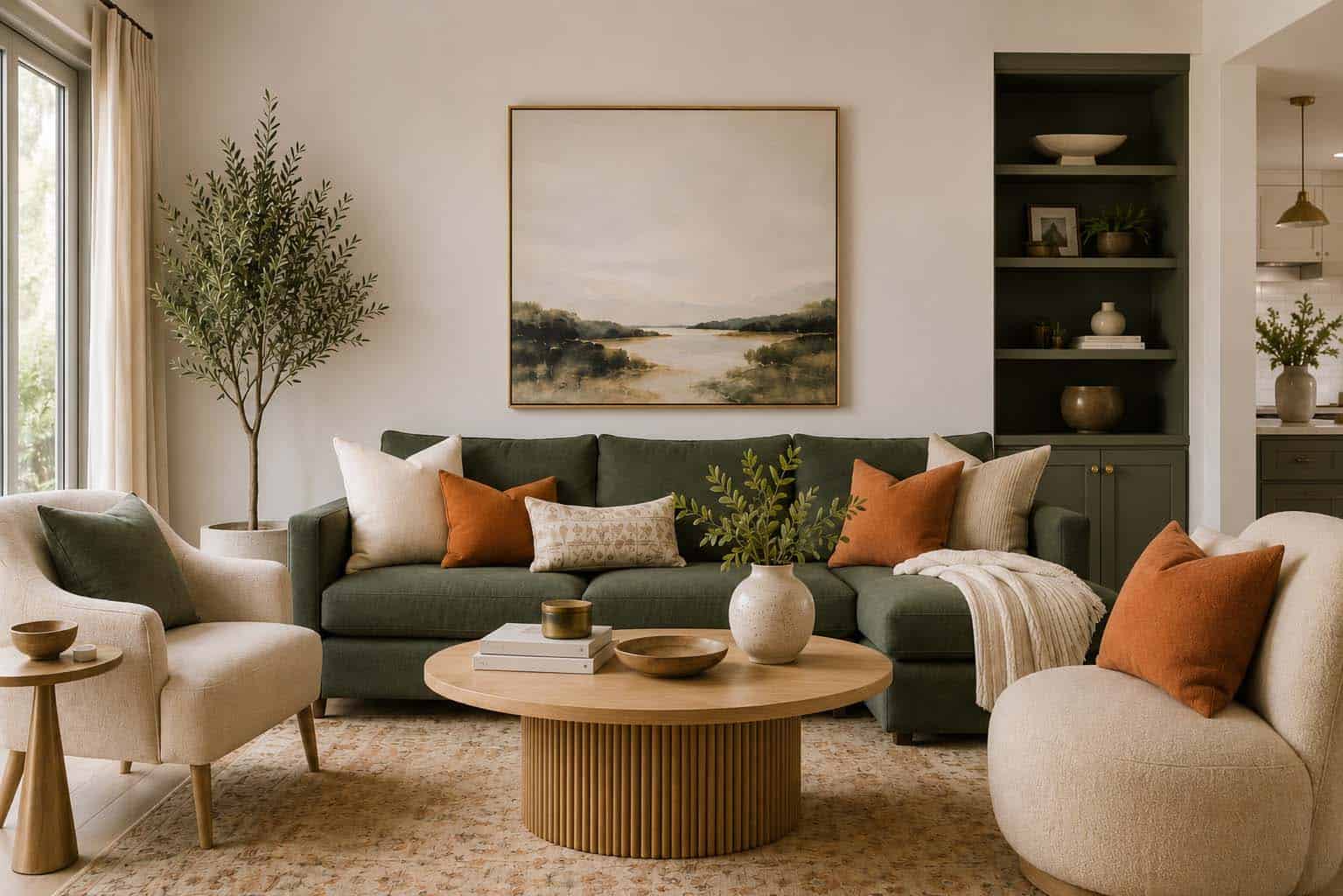
A Living Room Example
Imagine decorating a living room.
Your 60% color could be warm white walls with a light beige rug.
Your 30% color might be a navy sofa with matching curtains.
Your remaining 10% could come from mustard yellow pillows, artwork, and a decorative vase on the coffee table.
Even with only three main colors, the room feels layered, welcoming, and thoughtfully designed.
Remember That It's a Guideline
One of the best things about the 60-30-10 rule is its flexibility.
Some rooms look beautiful using three shades of the same color. Others combine warm neutrals with bold jewel tones or earthy greens. As long as one color remains dominant and the others play supporting roles, you’ll create a sense of balance.
Once you become comfortable with the rule, you’ll naturally start adapting it to fit your own style
Common Mistakes to Avoid
A few simple adjustments can make the rule work even better.
Avoid using several bold colors in equal amounts. When every color competes for attention, the room can feel busy and disconnected.
Give each color a clear job. Let one color anchor the space, another provide depth, and the final color create excitement.
It’s also helpful to repeat your accent color in a few different places around the room. A pillow, piece of artwork, and decorative accessory in the same accent color help guide the eye through the space and create a polished look.
The Bottom Line
The 60-30-10 rule is one of the easiest decorating tools you can learn because it works in almost any room and with nearly any design style. Instead of wondering whether your colors work together, you’ll have a simple framework that helps every decision feel more intentional.
As you decorate, remember that these percentages are meant to guide your eye rather than limit your creativity. Once you understand the balance, you can confidently mix colors, experiment with new styles, and create rooms that feel welcoming, comfortable, and uniquely yours.

6 Outdoor Lighting Ideas to Decorate Your Yard
When the sun goes down, even the most beautiful yard can become just a few chairs sitting in the dark. […]

The 5 Best Paint Colors for a Man Cave
Every great man cave starts with the right paint color. Whether you use the space to watch movies, cheer on […]